New Tool Icons for v2

I mentioned in another thread, that I’d really like to see some new tool icons for Avo2.

I’m not sure that the tool names and icons always reflect the concepts behind the features.

Looking for feedback… For example what are some examples of good icons (i.e., in other programs, websites) for:

  • animation / create a movie / playback
  • molecular dynamics

As an example, I’m wondering if something like this might be a better example of the “navigation” icon (e.g., rotate the view of the molecule):

navigator@4x

As a reminder, the current icon is:

navigator@2x

Here is an example from The Noun Project:

And here are some examples from Font Awesome:

Here’s an example idea for the animate tool, suggested by my teenagers… (i.e., “this is an icon used for making a movie”)

animate@4x

Instead of:

player@2x

Okay, here’s another possible icon swap:

bondcentrictool@4x

Instead of:

bondcentrictool@2x

Is it worth adding the 90° back into the icon?

@ghutchis For me, the addition of 90° adds visual clutter, especially with the eventual scale of the icons in mind. Hence I recommend to keep the new icon without this annotation.

For additional clarity, I would remove the arrows altogether; because it is not about a distance between to flag poles. Assuming there will be a grid in common the future icons have to fit in, without the arrows, there will be additional screen estate available to increase the size of the icon further if necessary/then deemed advantageous, too. What is going to be the icons’ dimension (some programs offer a set scaled at small dimension, or one if the screen is of high resolution as for Mac retina displays, or 4K) / at what scale the drafts should be seen now?

I have the impression the sector is off, i.e. overpasses the maximum diameter of the hydrogen atom (bottom right hand side), while not this much for the hydrogen atom top left hand side.

Just some thoughts on the icons. I really like the three changes you’ve made so far, to the View, Animation, Align, and Bond-Centric tool icons, I think they made a big difference to recognition and ease-of-use.

I have a few further thoughts on improving the tool icons, if you’re interested.

  1. Some of the icons are a bit too busy in my opinion, which harms their clarity. Simple is better for recognition of function.

  2. Since they’re fairly small, they also need to be distinguishable at a glance, and the use of the same water molecule for many of the icons harms this in my view as then >50% of the icon is the same between several icons.

  3. If the icon can be made to look like how the actual use of the tool looks, all the better (but only as a final minor consideration).

If you can point me as to where the icons are located in the repo I can have a go at making a few edits myself and demonstrate how I think they can be improved :slight_smile:

Concrete suggestions:

  • Remove the water molecule from the record symbol – it’s not even recognisable anyway, all you see without looking closely is two pale circles without it being clear that they are H atoms. I don’t think having the water there conveys any extra meaning.

  • I think the new bond-centric icon is very nice but it would be cool if the “bond” that is the centre of attention is highlighted. Though I’ve realised that it isn’t actually highlighted during use of the Bond Centric Manipulation Tool. Can we make this the case? Make the selected bond glow blue or green or something like when the Selection Tool is used?

  • Maybe we should consider whether the water atom on the Navigation tool icon is really necessary to convey the meaning of rotation of the view – I would argue it isn’t.

  • Find some way of making the black lines more visible on a dark interface – on my machine the arrows of the Navigation tool are hard to see against the dark grey background. A light and a dark version? Or give every Tool icon a white or pale grey background?

  • The hands of the Selection and Manipulation tools are right hands, as are the hands of most users after all. I find the direction of the Draw tool jarring as a result, as it is the way a left-hander would write, and it feels different to what is seen in other UIs e.g. the KDE Breeze cursors and the macOS cursors. Having the pencil pointing from top right to bottom left would make more sense to me. It would make it more consistent with both the hands and the pencil direction of the Atom Label tool.

  • Having the Atom Label tool icon show an “O” symbol on an oxygen misses a trick by not showing that the tool can be used to write whatever you like. I would make the icon more zoomed in (so the hydrogens aren’t visible) and just show the central atom, maybe parts of the bonds. I would probably then use a custom string such with a cursor icon such as: labI

  • The text on the Atom Label tool icon is hard to see because it is black on red, so at the moment the icon looks like a pencil creating a water molecule. An element should be used for the Atom Label tool icon which has a colour on which the text is easier to see, such as Si, H, F, or B.

  • Having two icons where the key element is a hand is confusing. They are visually poorly distinguishable, and given that the functions of each tool (select vs manipulate) are very different they should look more different. I would get rid of the hand from the Selection tool and replace it with a mouse cursor.

  • I think for the Selection tool, the cursor should point at the bottom right corner of the square, similar to during actual use. I think a molecule should be featured that is in the process of being selected, but with only some of the atoms in the square, and those in the square should glow blue, like when they are actually selected.

  • If the Manipulation tool has a hand icon, the user will expect the cursor to become a hand. Can we implement this? The hand should not be pointing like in the icon, but should be open before selecting and closed when dragging an atom, as done in other UIs (see e.g. Apple’s User Guide).

  • The Measurement tool looks good and conveys its meaning well. One could argue that it is not necessary to have both the ruler and the arrows, and that both could convey the meaning on their own, making for a more simple icon.

  • The Align tool icon is good, but the water molecule being aligned to a plane would be more obvious if it was aligned to the horizontal plane rather than the vertical, in my opinion, as then it has a significantly different orientation to the water molecules in the other icons.

If you think I am broadly speaking sense then I can have a stab at doing some mocked up versions :smiley:

Sure, that’s the point of this thread.

I’ll have a look at the toolbar sizes. Since I use a Mac, I’ve been getting much larger icons than show up on your screenshots.

Ok, nice. I assume the icons are the ones in avogadrolibs/avogadro/qtplugins/*tool/*.png for each tool. Are there vector graphic versions somewhere or only the pngs?

For the above .png files, I see there’s a 32x32 and a 64x64 version of each. Looking at the difference between screenshots on your system and mine here, it looks like on macOS the 64x64 versions are being used while on my system its just the 32x32 versions.

For what it’s worth, while you find the toolbar icons in my screenshots small, I feel they are actually a very appropriate size when you compare them to other toolbars. If you look at ChemDraw, Origin, classic Word/MS Office, LibreOffice, browsers, they all have similarly sized toolbar buttons. The iconography is typically simpler, however.

For the “new” ones, I have higher-resolution (128x128 or 256x256) or vector. I’ll figure out a good place to put them.

At one point on Mac, most programs could have configurable tool icon sizes. That’s sort of fallen out of fashion, with these simplified line-art style of tool icons.

On the other hand, here’s MS Word’s ribbon right now, which includes a mix of large and small icons:

Sure :slight_smile: That is overall a very different style of toolbar, though.

Another thing to bear in mind is that on Linux (and Windows presumably – I don’t remember it being any different, but I’d have to check) the Open, Save etc. options are on the same toolbar as the tool icons. If the tool icons were larger, they would have to be too, and then the text would either not match in size, or it would be comically large.

Though this is only in the default view and the “File” and “Tools” toolbars can be separated to be on separate rows by the user.

Requires some thought, anyhow!

I think the first question is the actual size. Can you check in a paint editor (e.g., GIMP, Inkscape, etc.)?

It’s also worth checking if there’s a good way in Qt to switch icons based on light / dark appearance. Several of those were set for a light background and are legitimately hard to read on your dark grey toolbar. Looks like Qt 6.5 might help: c++ - Detect dark application style/theme of currently used desktop in Qt - Stack Overflow

    // ...
    const QPalette defaultPalette;
    // is the text lighter than the window color?
    bool isDark = (defaultPalette.color(QPalette::WindowText).lightness()
         > defaultPalette.color(QPalette::Window).lightness());

Here’s what I have for PDF vector versions - mostly what I’ve redone recently. (I tried a few conversions to SVG with mixed luck.)

I think a key goal would be to generate “light” and “dark” style icons considering that’s become prevalent. (e.g., using white or light axes for dark mode)

I wouldn’t worry about the relative size of the “file” tools and the Avogadro specific ones. I’m sure we can figure that part out.

Just to check, is the graphic you uploaded a direct screenshot? I measured a few and they were generally 22x22 rather than 32x32. (Mine are 32x32 at double-resolution)

You are right, they do seem to be scaled to 22x22 pixels.

In the KDE human interface guidelines it is stated that 22px is used for ToolButtons, and I wonder if this is then applied to all Qt programs across the whole environment under KDE.

If this is true then this would actually be intended/desired behaviour, because all my ToolButtons are a consistent size across programs. And like I said, I think the size is appropriate for Toolbar buttons in the fashion of e.g. ChemDraw.

If this is too small for Avogadro’s purposes then I imagine we might need to use QPushButton rather than QToolButton.

That would be nice, definitely. Perhaps an alternative would just be to give all the tool icons a neutral background on which they look good. Maybe a desaturated, brightened version of the Avogadro 2 signature colour e.g. #97d1dd. Possibly wouldn’t look any good though.

I think it’s probably “easy” enough to have two versions of the buttons for light and dark window schemes. Seems like it’s fairly easy to detect, so I’ll add a utility function to switch.

For example, here’s a “dark” theme version of the navigate icon:

NavigateDark

I’m less certain of the upcoming Auto Optimize icons:

AutoOptLight AutoOptDark

Ok, sure :slight_smile:

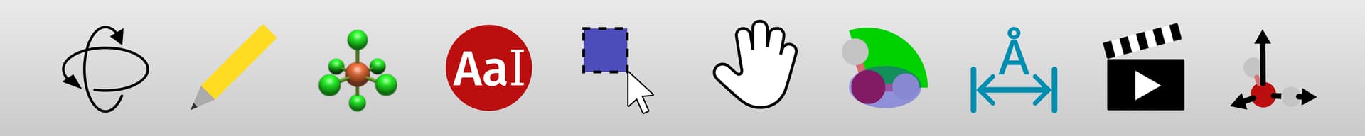
I spent some time (too much really, got carried away) playing around with the icons to see what I could come up with. I redid and made changes to all except the complex/ligand tool, for which I don’t really have any ideas yet.

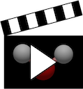
The overall result in dark mode:

toolbar1

Or another example with a few alternative versions:

toolbar2

For a start I made them all as 128x128 SVG vector graphics, which Qt can then scale easily and nicely for whatever DPI the user has and whatever size icon is demanded.

My overriding goal was to simplify the icons to improve recognition, distinguishability and clarity of meaning, mostly by reducing clutter and complexity, and make elements larger.

It is very possible to debate the merits of skeuomorphic design, however it is very much out of favour as a design language. I personally believe that a modern appearance makes adoption by users much more likely as they feel they are using a professional program, so I’ve tried to make the icons flatter by removing gradients and 3D effects.

Most toolbar icons these days are monochromatic but I think the colour is useful for distinguishability, so I kept it. In general I tried to make all the colours unique.

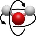
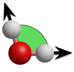
Navigation: Initially simplified by making the water molecule flat. I am actually now massively in favour of my second version without the water though. Generally the icon for panning the screen/dragging objects in a UI is something like this one, and I like the version that you came up with for 3D navigation, which is not dissimilar. I think the water just gets in the way of the meaning, and it makes it look too much like a Bohr model atom at a glance, so I got rid, and I made the arrowheads bigger and more visible to increase it’s similarity to 2D pan/drag symbols.

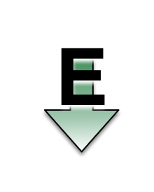
Atom labels: I possibly favour the version without the atom – there’s no other text tool to confuse it with, after all.

Manipulation: Felt it was better to show grabbing than pointing, as a pointing hand is usually used for links, not moving items.

Measure: Got rid of the ruler so that it looks more different to the draw tool. Used Avogadro blue :smiley:

Align: Again, I maybe think the water is unnecessary clutter and hinders recognition of the axes. I matched the axis colours to those of the display area.

Obviously these are all just ideas and I am very open to feedback, I don’t expect these necessarily to be implemented as is. But I personally like the direction, I think overall they are a lot cleaner and more modern, and are easier to identify as a result.

Thoughts? :smiley:

I think there are some good ideas here. I think “flattening” some and improving distinguishability and clarity of meaning are really important. It’s why I switched up the navigation and animation tools in the first place.

I remember some issues with SVG icons, but that may not be an issue anymore.

I think you mean the icon in the first image. I’m good with it, in part because it moves the scene, not rotating the actual atoms.

It could work if it becomes a more generic label / annotation tool. I think without an atom right now, it’s less clear. (OTOH, the example with water seems to crop the hydrogen atoms, so it looks more “devil”.)

That doesn’t read as “grabbing” to me. Maybe:

Another example “pinch”

Anything from the Noun Project is easy to get. I’m happy to pay the original artists.

I think this is good, although perhaps it’s not clear it also works on angles. (Not that the previous version did either. … one reason for having more tools.)

I wouldn’t use multiple colors for the axes. Since this actually changes the molecule, I’d probably go with white or black axes arrows and the water molecule on it.

Selection: This doesn’t read well as selection to me because it’s just a rectangle. Typically the “rectangle tool” has a dashed black/white border in the icon. (If we had a “lasso style” selection tool, that would also be an easier icon.)

Bond Centric Manipulate: I don’t understand why the oxygen and one hydrogen are so dark. I guess you’re trying to highlight them?

I did read that in Qt5 svgs can be fuzzy on high DPI displays, but a line of code fixes it and in Qt6 the default behaviour is correct.

Ok, I’ll keep the atom. The cropping was deliberate so that it’s bigger. If it looks weird though I’ll just zoom even further and get rid of everything other than the oxygen.

The other ones are less standard icons, that’s all.

Hmm, Ok.

Fair. I was trying to make it look like actual usage, but I can go for the (as you say, more typical) dashed outline.

Exactly, like when it’s actually being used. I think with just the angle it’s not clear the tool is used for bond selection, we need to convey that somehow. Maybe not this way.

Yep. Many of our icon needs are non-standard. That’s one reason I’ve been looking at Blender. :slight_smile:

https://wiki.blender.org/wiki/Source/Interface/Icons

There’s an easier interface to browse here:

It’s not that Blender is ideal from a UI perspective, but they have confronted similar needs for 3D manipulation and specialized tool icons.

Based on your feedback I made a few changes. In the light mock-up I’ve copied the light grey gradient of your macOS screenshot.