@ghutchis posted yesterday about adding to the documentation, particularly screenshots. Most of the current screenshots are on macOS, so for users on Windows or Linux who would contribute, their screenshots would be visually and tonally quite different.
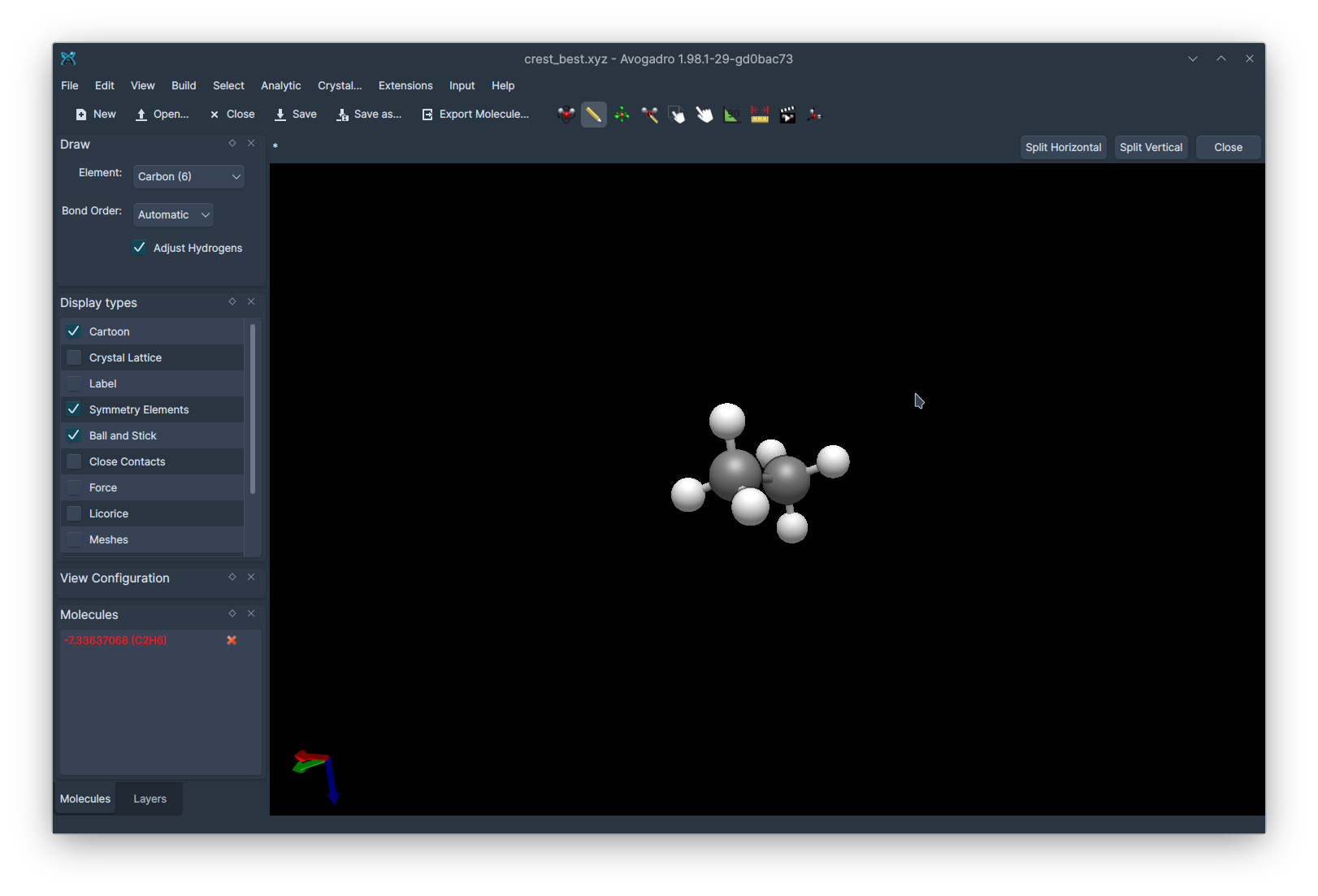
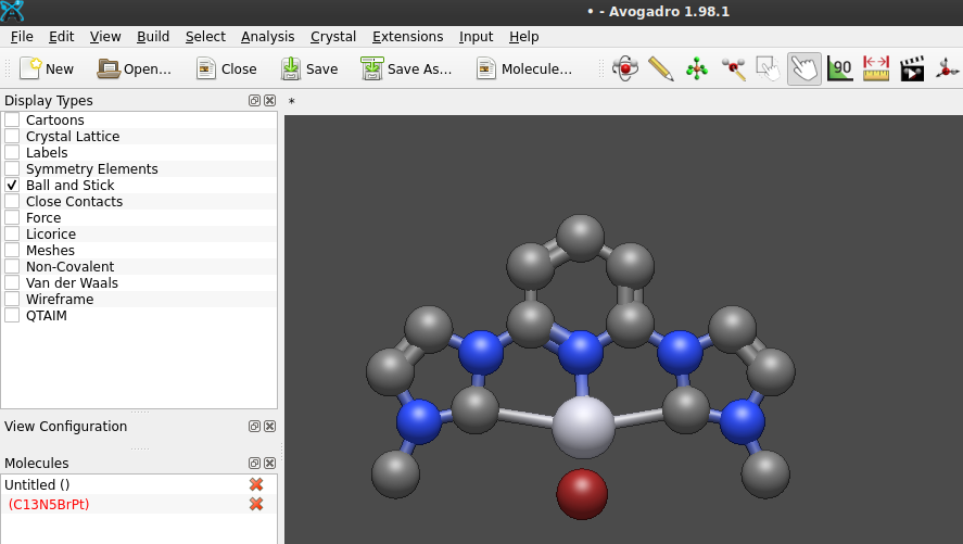
Here is what Avogadro looks like on my system, for example:
Should we strive for consistency in the documentation? Would it bother users to have screenshots jump between different styles of interface? Or is it fine to have a mixture, or even a bonus as it shows different possibilities that the user might come across?
If people want a single consistent view then we can then talk about which view of the many possibilities is most appropriate.
@matterhorn103 Could it be possible the icons once appear «normal», and once smaller/tiny because of different screen resolution (pixel per inch) during capture or/and display? I vaguely remember a program recently updated where one had to choose between normal resolution, retina display, and 4K.
A second point: perhaps it isn’t necessary to depict the whole screen estate in every screen photo. Only a molecule with the relevant structure features and toolbars from which provide the function in question provide. Then, the picture as depicted in the documentation needn’t be scaled this much to a lesser dimension, and the perception of «small/tiny» is less.
scaled by 75% in the mask here of an screen photo in full scale 1280 x 771 px):
That screenshot is just on a standard 1080p display, not a high DPI one!
I can’t remember how it looks on the 4K at uni, but as far as I can remember Avogadro looked pretty good. I’ll check this week.
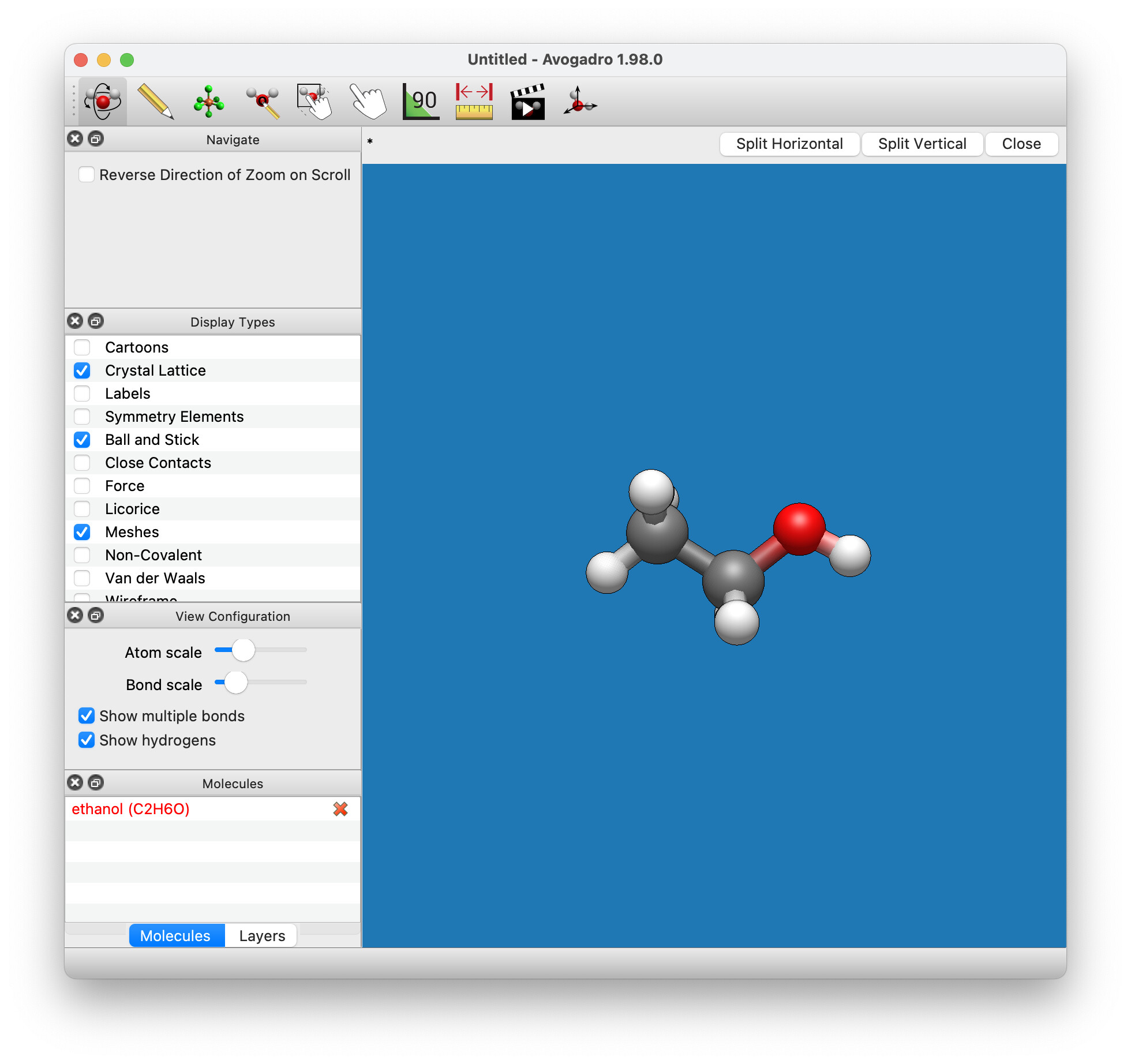
Absolutely, this is the way many of the screenshots in the docs do it at the moment so any screenshots I do would do the same. I was just showing how it looks overall.
One of the bonuses of being inconsistent () is that anyone can contribute screenshots to the docs. Requiring a specific platform and other settings would reduce the number of people it can potentially be spread across.