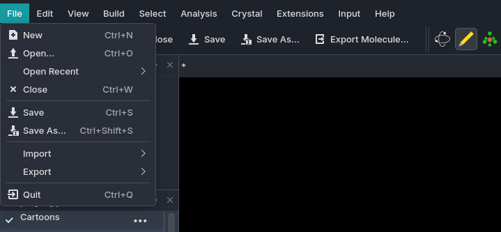
The icons in the menus and the “file” toolbar are sourced from the OS theme and – on Linux with KDE at least – change to match my icon theme, giving it a native look and feel. For example, on my system:
There are also some very nice third-party icon themes for KDE, I particularly like using this guy’s themes
If you wanted to use a set like that, I think it’d be best to then use the same theme for all the icons in the interface, as it looks quite jarring if there’s a mixture of visual styles (and we already have at least two sets since we have our own tool icons).
My feeling is that as much as possible, we should use the system theme icons. Getting everything from one source is going to be tricky unless we hire someone to do the whole set.
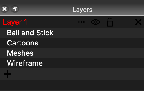
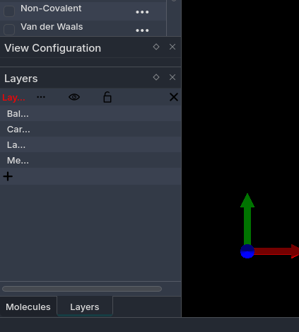
BTW, it seems like your Layer panel has weird column widths. The first column should be the widest.
Yes, sure, but my point is that it would still be better to use two sources than three.
The tool icons are cohesive and self-contained in one place, so while it’s not ideal that they are different to everything else, I’m not as worried about them not fitting in with a uniform design.
All the other non-tool icons used in the interface really ought to have the same visual style, though. Consistency is very important in good UI/UX design.
I’d love it if Avogadro used my system icon theme for the icons, but that should only happen if all icons can be sourced from the system theme, otherwise it’s jarring.
It looks pretty complete based on your comments. The pull request will try to pull from the system theme (e.g., visibility or lock) and go to a fallback otherwise.
Take a look if you like. I think it should be set. Certainly it fixes up the text colors.
It might be worth mentioning that currently Av2 doesn’t have dark mode on Windows right now. I believe @matterhorn103 indicated that the Qt6 upgrade will fix that, but for now it’s light mode all the way.