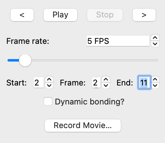
I think while the “Frame” spinbox used to be fine before, now that there are two more boxes, it is confusing as is. If the current layout is kept, I propose changing it to “Current frame”.
My other question is, do the start and end frames affect the exported animation only, or both the live playback and the export?
I also think that there are now too many ways (four) to change the current frame being shown: there’s the scroll bar, the manual entry box, the arrows for the manual entry box, and the forwards/backwards arrows.
The latter two especially have identical functions, so I think that the up/down arrows next to the frame number should be jettisoned and it should be a simple numerical entry box rather than a spinbox.
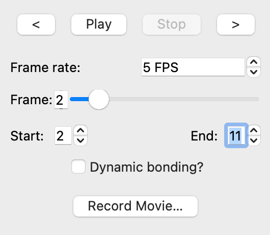
My suggestion would then be to separate the “current frame” number from the start/end frame controls to reduce confusion, as they handle different things. The current frame could be placed next to the scroll bar like so, for example:
(Though I guess it should be Record… with an ellipsis since it opens a dialog.)
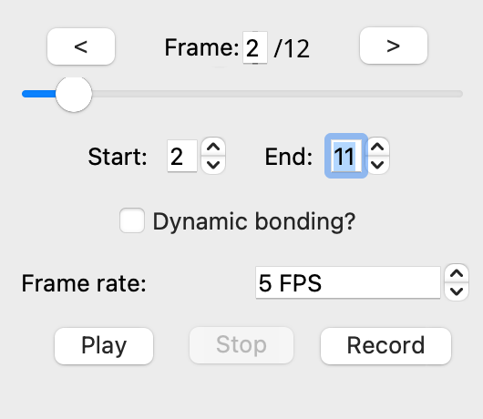
This way:
all the controls for the current frame are in one place together, which makes sense for the user, and it is as a result clearer what the scroll bar does IMO
the most used controls are those to change and select frame, especially as the animation tool is not just for actual animations but is also currently the way to look at conformer ensembles and other sets of molecules, so it makes sense to have those all at the top
if the start/end frame controls also restrict the frames that can be viewed it is also useful to know how many frames there are in total, hence the 2/12
the controls concerned with playback and recording are all grouped together, including the frame rate setting
playback/recording is done after setting all the settings appropriately, so they are placed at the bottom, just like OK/Cancel/Reset buttons in dialogs in general
I also think ideally the classic universally recognisable symbols would be used instead of a text description, don’t how easy that would be.
I don’t know about the play, stop, record symbols. (If they’re used, probably the correct thing is to merge the play and stop buttons so it switches as expected between and accordingly.) Should be possible since they’re emoji now.
While we are discussing this, I think the current use of “Stop” is slightly counter-intuitive. The opposite of Play is Pause (which is the current behaviour), not Stop. An actual Stop button would do a Pause+Rewind.
Maybe the playback modes could be radio buttons instead of checkboxes? These seem to be mutually exclusive choices and checkboxes imply that zero, one, or multiple of them may be selected, while radio buttons (eg. Normal, Loop, Boomerang) convey that exactly one of them can be selected at a given time. Reverse is technically valid for all modes, so that should be a checkbox.
IMO the Play/Pause buttons should be merged into one button that always displays the opposite of the current state, ie. when it is not playing and when it is currently playing. This would free up room in the box for an independent stop button.