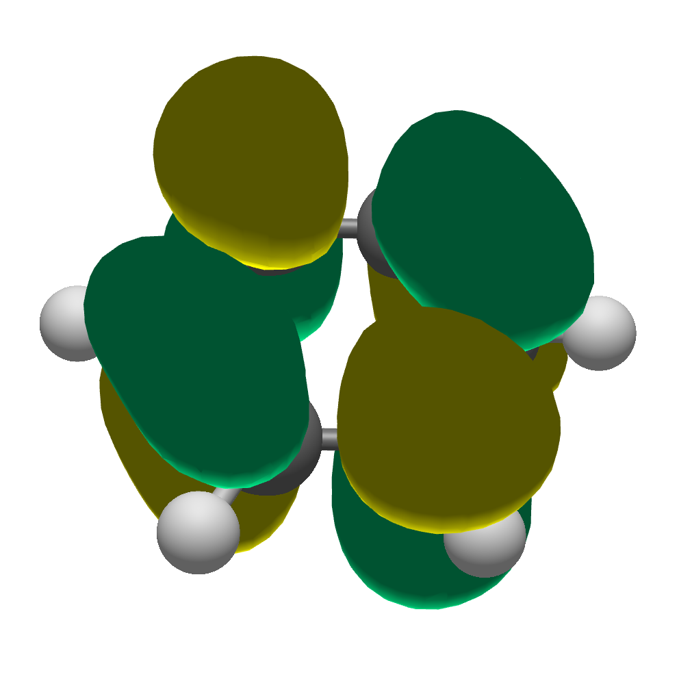
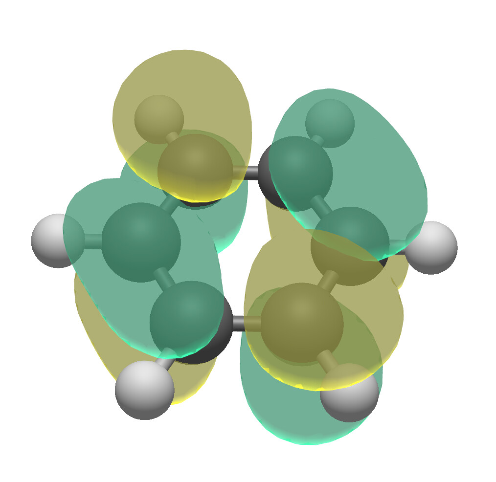
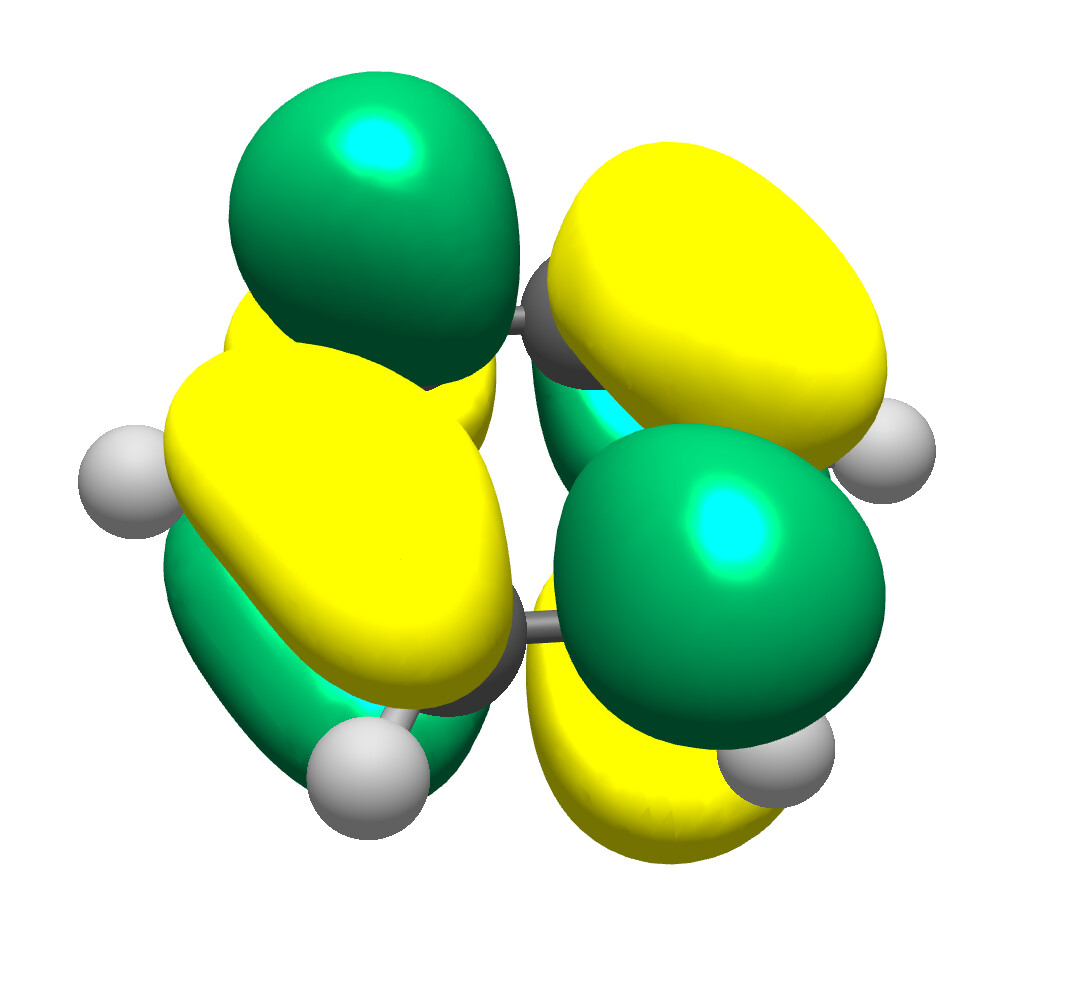
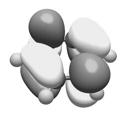
Counting the examples from 1 to 4 from top to bottom, as concept I would like the #3 the most followed by pattern #4 (vide infra) because pattern 1 and 2 both tend to be too dark (especially the first pattern). I hereby think about e.g., poster sessions. Imagine to see such an illustration from distance (perhaps anyway on a darker background) one, two aisles away; this is going to yield a gray/black blob hiding away (camouflage like) which is not attractive (for me).
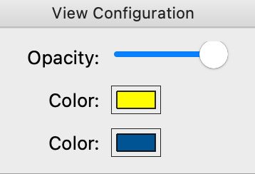
For the selection of colors of the orbitals, I would like to suggest to consider an additional choice to choose from/select to grasp easily positive vs. negative which is retained if the publication is printed on paper (still many do)/xerox in b/w or grayscale: yellow-white-purple.
One may mimic the outcome preparing the illustration (e.g., in inkscape, extensions → color → grayscale) in a GUI based program, or with imagemagick on the command line (convert input.png -colorspace Gray output.png). The present choice isn’t well suitable for color blindness (inkscape offers to mimic a few types, filters → color → color blindness; optional with live preview). In this perspective and for similar reasons to abandon a color scale in jet scheme for one with continuous change in hue (like viridis), I would suggest something in line with ogre-white-purple.
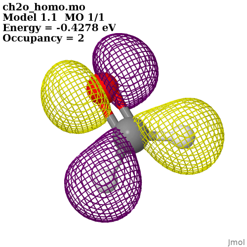
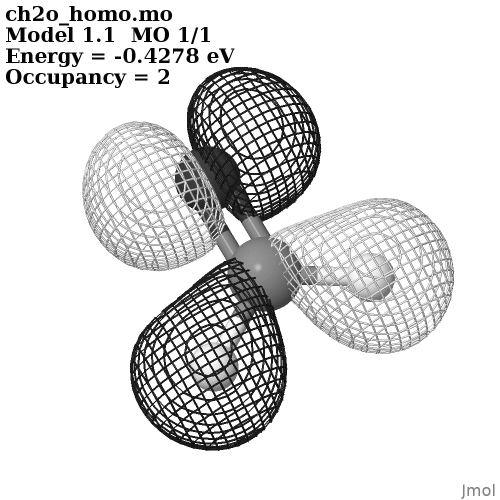
As an illustration, a visualization created with Jmol (entry interactive documentation):
I’m not sure about the color coordinates Jmol then uses, however in appearance on screen, it comes close to the diverging colormap (#f1a340, #f7f7f7, #998ec3 in hex) offered by colorbrewer.
Clicking through the types of color blindness inkscape visualizes/creating a gray-scale copy with the pattern suggested by you/your student looks like the two pattern could be offered along each other in addition to the red/blue so often encountered:
For both color palettes, there might be some overlap of the colors regarding the orbitals with the colors to designate the atoms (e.g., yellow about sulfur, different tints of green for fluorine vs. chlorine, etc.). Because the optional use of atom labels may prevent confusion, this should not be an issue.
(Not touching the question if color blindness is an example of section 504 ADA/rehabilitation act.)