My idea is that this “Plot Conformers…” dialog would allow you to switch between RMSD or relative energies. It would also offer a “Scale Energies” to convert from Hartree, eV, etc. to kcal/mol as needed. (In this case, the relative energies were in Hartree.)
And you can click on the plot to switch conformers.
I think that it would be nice to track forces, although I think it would add quite a lot of complexity.
For example, do you plot the total force, the total force in the x, y, and z directions individually, the force on each atom, the force in each direction on each atom, or something else entirely?
I would really enjoy seeing all of those as options, but that adds a lot of complexity right off the bat.
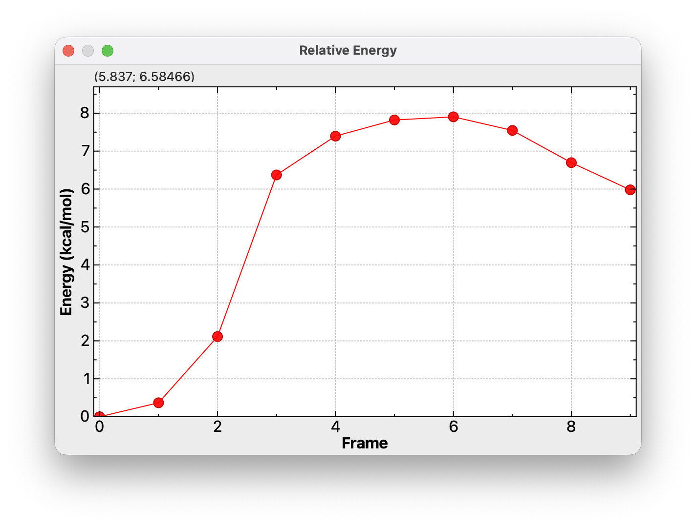
Also, in general I feel like plotting introduces a lot of desire for customization (if you give a mouse a cookie…). For example in NEB plots like the one you have shown, I would really prefer a way to label key points, for example the reactant/product energies and the saddle point energy.
It has been a long time since I’ve used Spartan, but IIRC they had a pretty reasonable plotting interface. One thing I especially liked was that right next to the plot they had a table where you could see all of the energies listed out, and if you were plotting say, dihedral angle on the x-axis then you could see that listed in the table as well. I’m not sure how easy that sort of thing would be to pull off though since I am not sure if Avogadro can retain that sort of information across the individual geometries in an XYZ file.
For conformers it would be nice to be able to plot a Boltzmann distribution, since realistically a scatter plot or line plot doesn’t really contain all that much information.
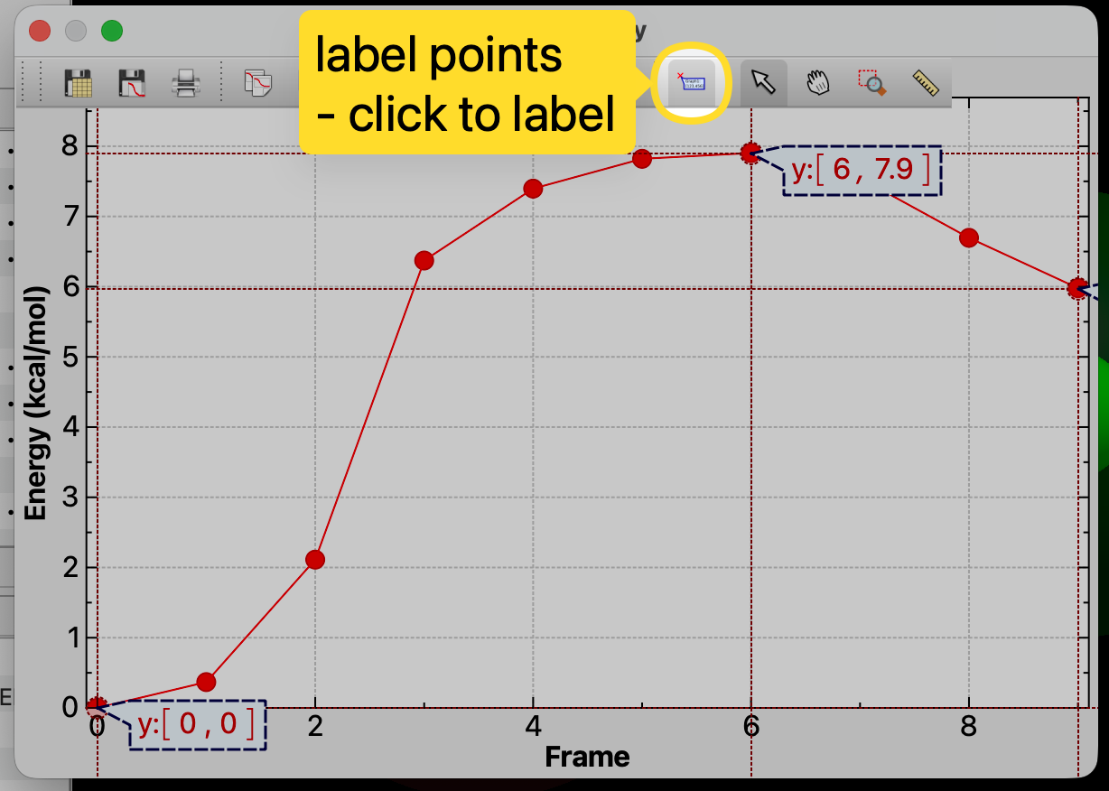
It’s obviously not perfect - I’d like to add a “click to add manual label” mode for the spectra as well. At the moment these don’t export into a PDF or other image and the needs differ (e.g here you probably just want the y value to a few decimal places.)
In this particular plot, clicking will jump to that frame, so maybe a control-click or shift-click would add a manual label?
I think you want some sort of histogram of energies with Boltzmann weighting or something, which makes sense. Submit a feature request, but it’s definitely “after 2.0 is released.”
One of the changes with the AutoOpt tool is that measurements, etc. will persist across multiple frames. So yes, if you create a measurement of a dihedral angle, that could show up in a table. Certainly even now if you have this, you can display the distances across the frames:
I’ll set this down as a tutorial to add to the website.
As far as forces, it’ll take a bit of time to get some of the “plumbing” in place (e.g., reading it from files for each frame, etc.). But I can easily imagine wanting to plot maximum force or RMS magnitude or something over time. (As you said, I can imagine a lot of things you might want on the plot.)
Another program I use to visualise my calculation shows indeed both the energy and RMS force (which I personally like). They are overlapped in one plot with two different y-axis.
Seeing as it is an NEB you could also consider using a spline to connect the points. It is more of an visual choice but a cubic spline would porbably better present the PES than straight lines.
There’s an argument to be made both for and against spline interpolation for NEB plots.
The density of sampling on the potential energy surface is directly proportional to the probability of a continuous energy profile; for smaller calculations, say 5 points between reactant and product, there is not a guarantee of the PES being free of discontinuity and/or unresolved features.
I for example have been running many calculations of a sort of “PES” in my research, and if my sample number was lower than it is now I would absolutely not have a good picture of the trend. With how high my sampling step is though, I can nearly guarantee that a smooth, interpolated line is indeed the correct way to plot the data.
For right now, I’m going to stick to connecting lines. It’s something worth discussing for post-2.0 (e.g., identifying the type of multiple coordinate sets - NEB, IRC, conformers, trajectory, etc.)
I’ll put in some initial work to handle force and velocity magnitudes, but at the moment, it’s not a high priority. (i.e., just because the window can plot them, they have to be read in from various formats)
Thanks for this feature, really useful! Another improvement may be to set the X-axis value to other properties of the structure, such as a given bond/angle/dihedral (e.g., the one selected on the properties dialog when opening the conformer data dialog). This would unlock the possibility to show relaxed scans (e.g, by opening the allxyz file from an Orca relaxed scan run).
I’m open to suggestions on the UI. I’m not so sure about a simple selection - I think it would be better to require some sort of “add this to analyze” context menu - much like the constraint (and resulting lock icon) in those tables.
But I’m very flexible on how the UI would work best.
Similarly, I can imagine people might want something like a Ramachandran plot for clustering geometric parameters (dihedral, dihedral or bond, bond, etc.) in 2D
Hi, yes, something parallel to the constraint mechanisms sound a much straightforward way to proceed. I have not so much experience with C++, but I’ve already dug a bit in the code and will take a look to it when I have some time just in case I find a way. Thanks for the reply!
I’ve taken some time to compile a working version of 1.103 (the upgrade to Qt6 broke my previous environment), but I finally have it. I will explore the files that I already identified as relevant (mainly in the qtplugins directory), and of course, AI will surely give me a hand.
For the moment, I just made minimal changes to have a proof of concept (and start identifying issues to solve, such as the way the conformer is selected), and this is what I got:
I will be working on this not so fast, but I hope to have a working version ready for next year’s computational lab in my chemistry courses (by mid october).
Great! Let me know how I can help. I can certainly suggest some places (e.g., storing the list of properties to analyze)
Several people have asked to be able to scan a bond length or angle (i.e., picking the geometry and generating the individual conformers) which seems related.
If nothing else, I should have more time over the summer to help with this.
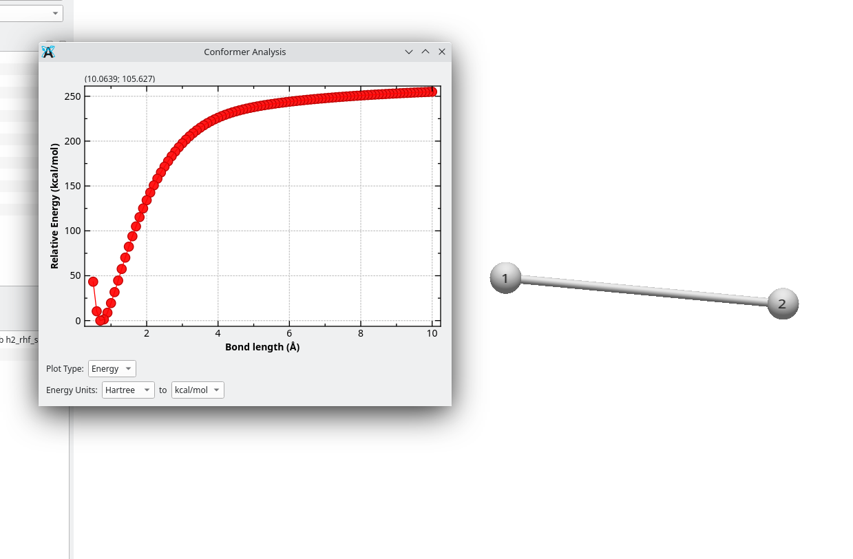
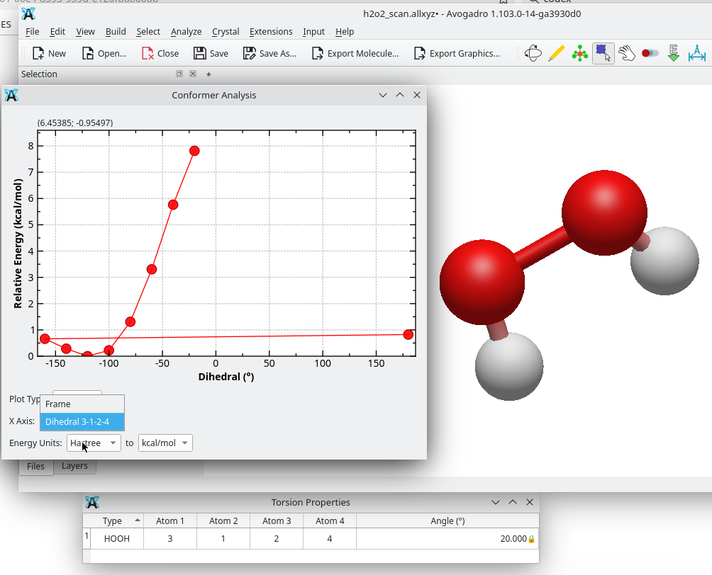
I’ve been able to implement the idea in a more concrete way. Right now, in the Conformer Analysis / plot conformers dialog it’s possible to choose the X-axis either as the conformer frame index, or as the value of one of the constrained coordinates (distance / angle / dihedral) previously defined in the constraints table. So, to have a coordinate appear in the dropdown, the corresponding constraint has to be defined first.
There is one caveat at the moment: if the plot conformer dialog is opened before defining any constraints, and then constraints are added afterwards (e.g. from the properties tables), the dropdown doesn’t refresh automatically. This is likely fixable
Here’s an example with an H2O2 relaxed scan. As you can see, from the dropdown you can select either Frame or one of the constrained coordinates, and in this case plot the relative energy against the dihedral.
This approach deliberately reuses the existing Constraint object, i.e. it doesn’t introduce any new data structure. Since relaxed scans actually involve constraints anyway, that reuse seems reasonable as a first step. That said, for longer-term use it might be cleaner to have a dedicated object (e.g. ScanCoord) or to extend Constraint with scan info (e.g. start/end/step). That would make it easier to pass scan definitions to the QM input generators (in the same way constraints already appear in the ORCA input), and it could also open the door to running relaxed scans from inside Avogadro using the optimizer.
What do you think? If this direction makes sense, I can either prepare a PR with the plotting change (maybe after fixing the dropdown refresh), or we can discuss whether it’s better to rethink a bit and wait after the 2.0 release (so as not to “contaminate” the 2.0 release)
It looks great - and yes I’m sure it would be good to extend the constraints with scan information to pass to input generators, etc. (Does your code actually generate multiple 3D coordinates that you can animate? Or does it just add some info that the plot window uses.)
Yes, I do not think we should add new features at the moment. Scanning is a great feature, but I don’t want to add more work for translators and I want to be sure the 2.0 release is as solid as possible.
You can definitely open a PR in the meantime and I’ll give some feedback. I have a few work-in-progress branches that I’ll post sometime soon as well (e.g., storing custom atom / bond / residue / conformer properties).
It just adds info to the plot conformer window. Clicking on the plot updates the structure in the main window, similarly as done in the original implementation. Actually, similarly to that one, the conformer is selected based on the position of the pointer in the X axis (frame or coordinate value)
Is it possible to use a keyboard input to switch through the conformers? I have a long optimization and I feel being able to use the left or right arrows in the keyboard would be very helpful to scan the configurations and understand what the geometry optimizer is doing instead of manually clicking points.
Also, it would be helpful to “know which point you’re on” with a different color or a shade. I found myself clicking through the points and, since the structure wasn’t changing much, I was unsure whether the selection was working or not.
I was going to suggest switching to the animation tool, but I see that doesn’t have keyboard input. Seems like using left / right for the animation tool would be an obvious help. (And maybe up arrow = “go to the start” and down arrow = “go to the end”)
I don’t think it would be too hard to add a different color for the current point. I’ll check on that. (Might have to be an extra series, but that’s just an implementation detail.)
In the meantime, in the Conformer Properties window (table) you can click on a row and it should go to that geometry, leave that row selected, and accept up and down arrows.