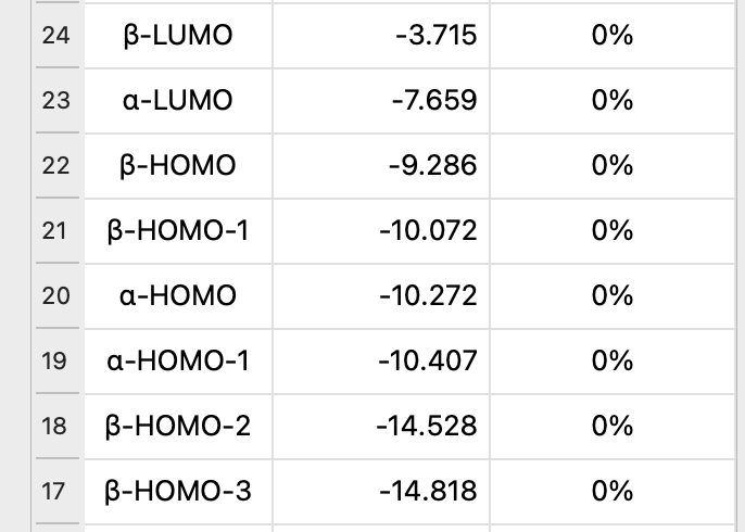
For the moment, I’m listing alpha and beta and attempting to guess them.. on the other hand, that obviously doesn’t go great because of course the alpha and beta orbitals don’t always match up.
I’m open to suggestions on how to handle these (SOMO?) .. as well as whether I should use the “status” column as “occupation” for open shell systems? (e.g., ↿⇂ and ⥮ or other indicator)
I think it’d be nice to have an occupancy column in general, not just for open-shell species! I don’t think you should reuse the status column - it’s function is still equally valid for open-shell species, and it just conflates the two meanings.
The classic arrows would be one option for filling an occupancy column, though I would suggest as an alternative using a great big bright circle to show occupied and a dark one for unoccupied e.g. or or as appropriate, or with or something. To my mind that’d be a much better immediate visual indicator than the arrows.
When showing alpha/beta orbitals, the occupation symbols could then be different colours to indicate the different spins e.g. for up and for orange, or something more distinct if preferred.
Regards the labelling of the orbitals, I think I’d recommend just numbering them and not making any claims of anything being a HOMO or LUMO or anything. If there is a status indicator then that will be clear anyway (in fact, I think the level of the HOMO would be even more obvious).
At least that’s what I’d do for unrestricted calculations. For restricted calculations it’d be nice IMO if Avogadro would combine the alpha and beta, as in, display it pretty much like normal closed shell orbitals, but with a status indicator so that SOMOs can be readily identified.
Yeah, I’ll get there - I’m just not sure I’ll have time to code that before 06 Feb.
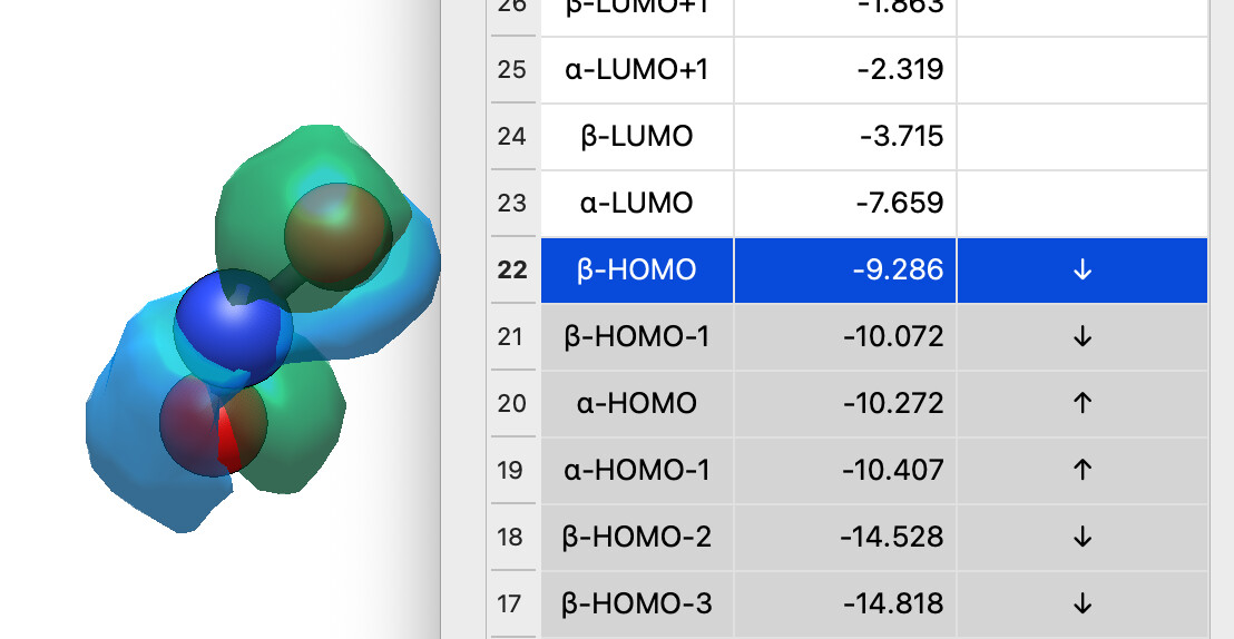
I thought about circles, but I think it’s less clear than arrows. ↑ and ↓ and ↑↓ are pretty universal. (I used ↑ this time because the ↿ arrow looks really small.)
I’m talking about replacing the status column entirely .. many of the recent builds seem fast enough it’s not needed IMHO.
I think this option is what I’d prefer, although there are arguments to be made in both directions. Part of the benefit of the numeric labeling is that if Avogadro ever chooses to support fractional occupation number weighted density analyses, since in those cases you’ll most certainly not be getting integer occupancy in the frontier orbitals.
On the other hand, I think that most students relate to HOMO/LUMO better than occupation number, which would certainly be useful given the use of Avogadro in educational contexts.
Perhaps there’s a balance to be struck with column and row labeling?
Yeah, I thought through that. It’s maybe a good idea for a revision. The downside is that it makes the selection logic quite a bit more challenging since you’d have one path for closed-shell species (select a row and you’re done) and another path for open-shell species (select a specific cell to get either the alpha or beta spin orbital)
It’s probably the best direction for the future, particularly for restricted open-shell because you can clearly spot the SOMO.
What I’ve got now is definitely not perfect, but I thought it would be really weird to ship a 2.0 release which supports open-shell calculations, but the orbital table only shows the alpha orbitals…
I think that perhaps the selection logic could always be that it selects a cell, and strongly highlights that cell and then weakly highlights the row, adding only logic to weakly highlight the column if the calculation is open spin. I think it’d only need one branch if I am not mistaken.
Perhaps if I can find a way around the current problem with Nvidia drivers on Linux I can take a stab at it myself.
You’re probably right, and in that case it makes sense for closed-shell species, but it’s not viable to do the same labelling (certainly not in a consistent, programmatic fashion) for open-shell species.
Fair enough. Another option might be to combine the two and have an arrow superimposed on a circle?
I just think that the colouring, or more specifically the filled vs unfilled appearance, is a really useful visual clue when scrolling up and down the list.
An alternative might be to lightly shade the status column (or the whole row) depending on occupancy?
In any case I definitely like the idea of swapping the status column for occupancy. If you still wanted a trigger for rendering, it could be a simple checkbox instead of a progress indicator.
If you’ve got an SVG in mind, we can look into embedding an icon in the table, otherwise I’ve been looking through Unicode / Emoji characters. ↑ ↓ and ⇅ seem to be fairly standard.
Some level of shading for rows of occupied vs. unoccupied seems like a good idea. (Less sure about how that’ll look in dark mode, but I guess there would be a contrast still.)
It adjusts the luminance of the background - slightly darker for light backgrounds and slightly lighter for dark backgrounds (e.g., dark theme). Should work even if you’re not using white / black.
Looks nice! I would swap the colours though – greyed out for unoccupied, white for occupied, by allusion to inactive and active elements of a user interface respectively.
When I’ve shown this to people, the general feeling was “shaded = has electrons” in an orbital diagram (or bands in solid state) not connecting to UI elements at all.
I made a slight tweak to the arrows (i.e., padding with spaces) so the up arrow for alpha orbitals is slightly to the left and the down arrow is slightly to the right. It’s also directly using the occupation information in the basis set if available.
I’m sure there will be improvements (e.g., after 2.0) but I think it’s a decent start and I’ll update some screenshots in the docs.
Fair enough, but in that case I’d make the shading some colour rather than just a neutral light grey very similar to the one that tends to denote inactive elements.
From the code, it seems that the issue originates in the way the LUMO is estimated (in core/basisset.h) when occupations are not read from the QM output (currently, this appears to affect all formats except CJSON):
// fall back to electron count return m_electrons[0] / 2 + 1;
Which misses one electron in open-shell systems.
More generally (for radicals, but also for triplet states), the occupations for open-shell are assigned incorrectly, as they are not based on orbital energies but instead split evenly between alpha and beta orbitals.
In these cases, an energy-based occupation assignment would provide a more reasonable guess. Of course, the preferred solution would be to read the occupations directly from the QM output whenever available.
I have submitted a pull request (#2658) implementing these changes (to core/basisset.h and qtplugins/surfaces/orbitaltablemodel.cppm in the latter an energy based ordering is implemented), in case a different strategy is not already planned.
IIRC it should read occupations from Molden. As I mentioned on GitHub, I appreciate the pull request since I’ve been working mostly on the plugins / packages.
Yep. That’s definitely on the TODO list - particularly ORCA, fchk, .. the formats we support in quantumio - it’ll take some work to get that into Open Babel as well.