Do you do graphic design? Like to tinker with icons? Know someone who does?
We could really use some help.
We want to make Avogadro2 the best molecular editor / builder possible. We’re proud that Avogadro 1 was considered easy to use (ignoring speed / crashes).
For example, here’s the current toolbar:

Without looking at the tooltips, can you understand what all of these icons do?
Do these icons reflect good, modern UI design?
Ideally, we’d like to work with someone with a combination of some chemistry experience and some design / icon or UI/UX expertise.
Other feedback or suggestions are also welcome!
Iconography may spur many discussions (e.g., Martin Keary/tanatcrul when addressing issues in musescore in his old youtube video, for his stance on icons jump directly to 6:30 min:ss).*
For the icon bar shown – though hovering with the mouse activates a tool tip, and over time one develops a muscle memory which icon offers what functionality – I speculate that a first time user of Avogadro may indeed be a bit puzzled as I was. Why do both the second and third icon both display a pencil? Do they relate to each other? If so, how? Why do both the fourth and fifth display a hand and index finger?
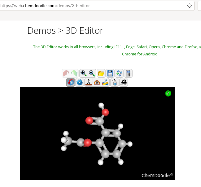
In this regard, I perceived Theisen’s chemdoodle as more intuitive. Because chemdoodle webcomponents are shared with a permissive license, would he (a chemistry alumni of Rutgers/NJ)/his company be interested to join? As an example of the icons created, compact, small in dimension and easy to grasp:
To provide an example, I intuitively understood the cube with the bent arrow in lines as “rotate the structure” without try-and-error. Not not so much with the four pointed star, where the tool tip indeed was needed.
*) Martin later joined musescore to lead the development, so his review of the subsequent version 3.6 (youtube video) may be described as “the program’s interface advanced a lot”.