A little something I worked on a few weeks ago:
With the milestone 2.0 release not lying too far in the future, it won’t be long before two.avogadro.cc becomes the main landing page for the Avogadro program.
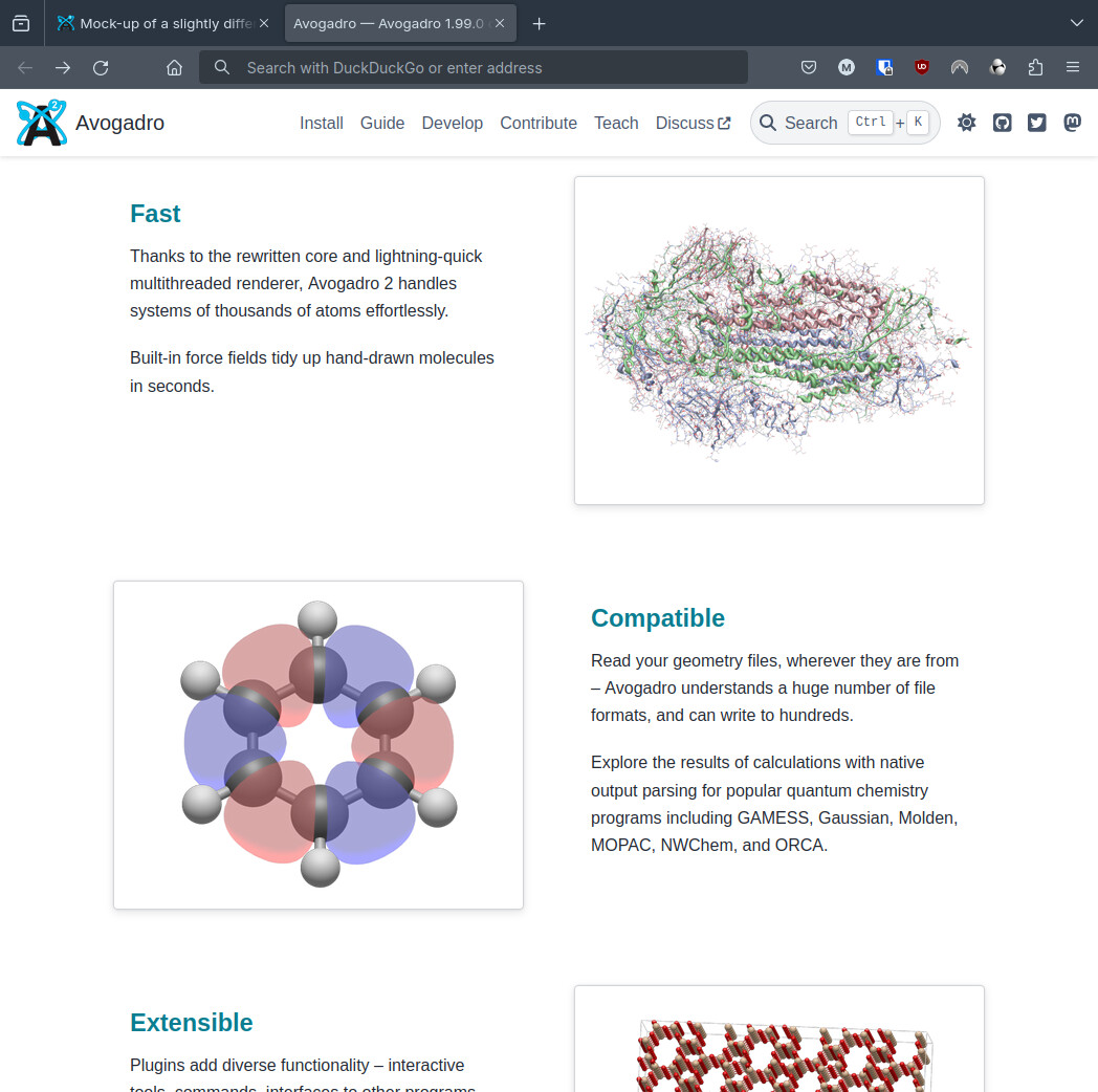
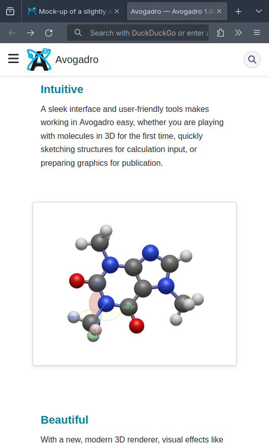
The website is reasonably nice already, it’s clean and simple, but it doesn’t really show off Avogadro’s beautiful rendering and sleek interface all that much, which I think is a shame. The screenshots are only shown in a small carousel, and the GUI not at all! Avogadro is a very competent tool imo and I thought maybe the website ought to convey that and sell it more, make it look as professional as it is. Since Avogadro makes molecules look really, really nice, that should be easy, just by showing them off! ![]()
So since @ghutchis had expressed some admiration of the Blender installation options widget, and KDE had their recent 6.0 release, I looked to both for some inspiration, as well as other big open-source projects.
I spent a chunk of time on it to get consistency and a good appearance at different screen sizes, and I think the result looks pretty nice. As a preview:
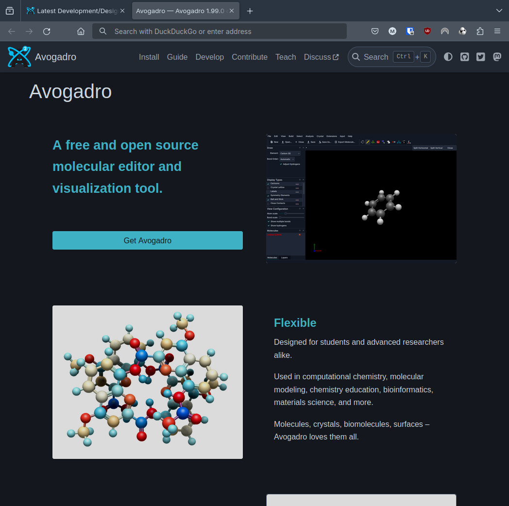
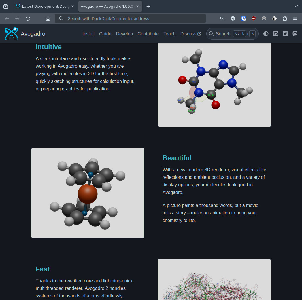
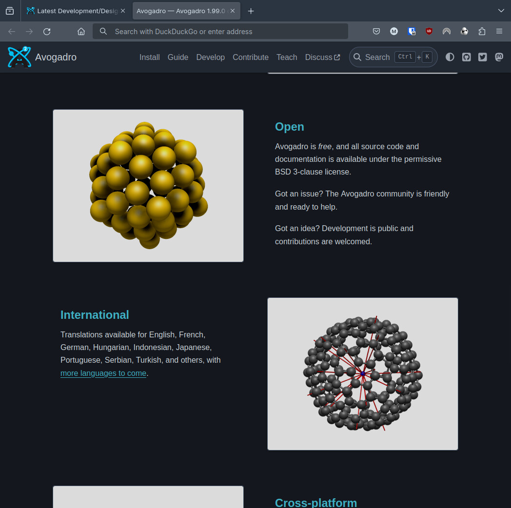
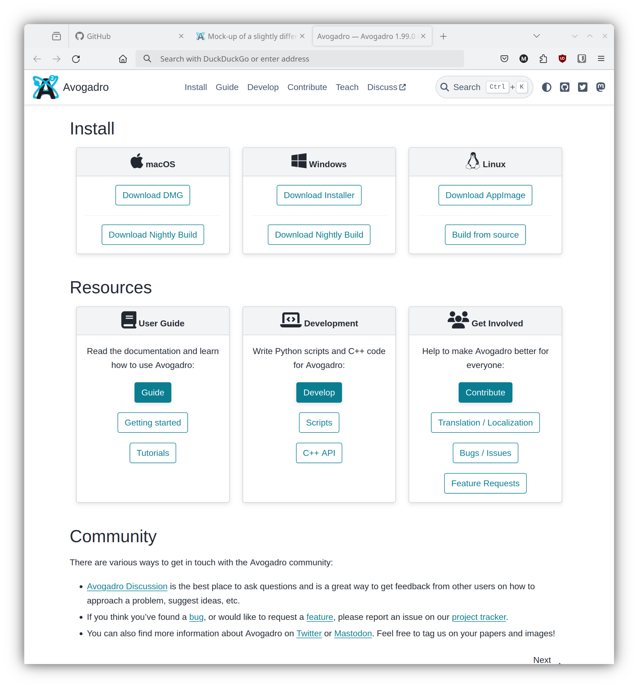
It gives a bit of a tour and a breakdown of the key selling points. I included a big install button that could be replaced with the planned implementation. It could look even better with some visually stunning, high-resolution screenshots, and I’d like to show the GUI more. The ideal thing would be some GIFs of things like bond vibrations and molecule manipulation. For now I just used a few pics I could find.
I would love feedback and ideas and to know what others think!
This branch contains my idea, and I opened this PR for it.
(Note that not all the commits there are specifically for the proposed home page, I’d take them out of the PR later.)