Ideas for changes to the Labels display type

I’ve been using the Labels quite a lot recently when creating input files in ORCA that involve constrained optimizations, and I have noticed some things that I think might deserve an update.

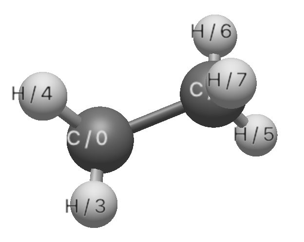
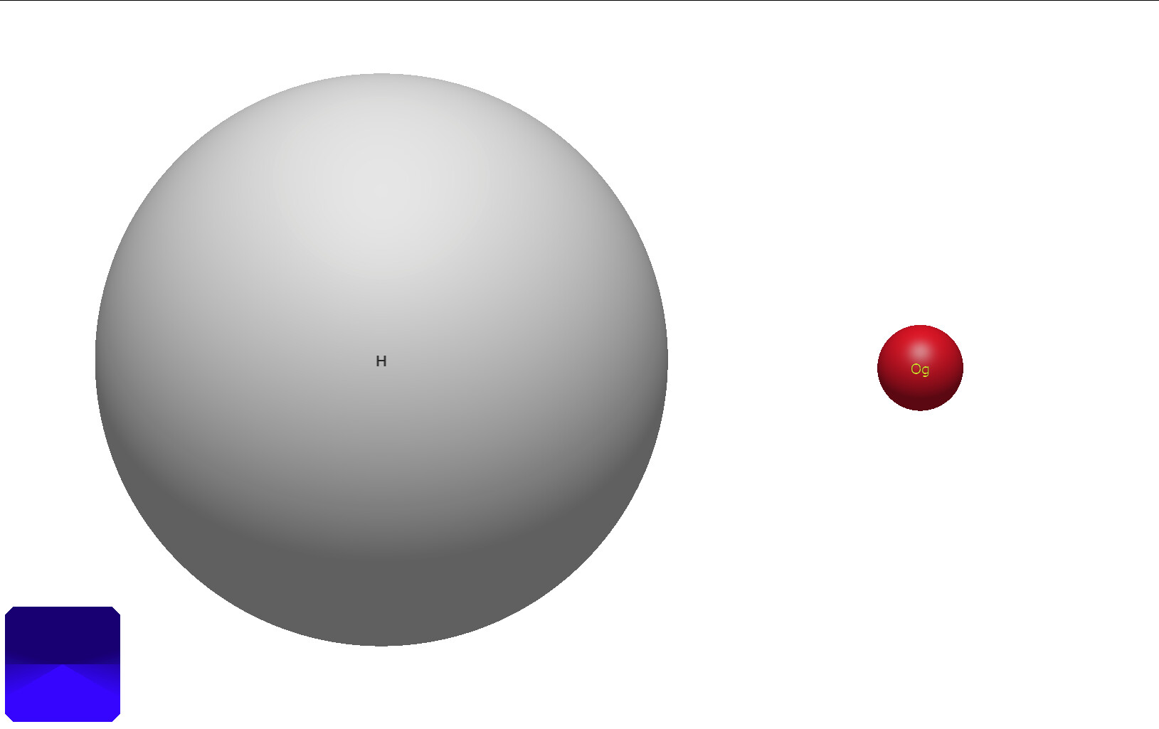
My first thought about the labels is something that I’ve noticed somewhat recently, and that’s the strangely low resolution of the text that is displayed on the atoms. If we look at a picture of a typical molecule with the Element & ID label (any label will do though), we can see some very clearly rendered atoms, but the labels look a bit fuzzy.

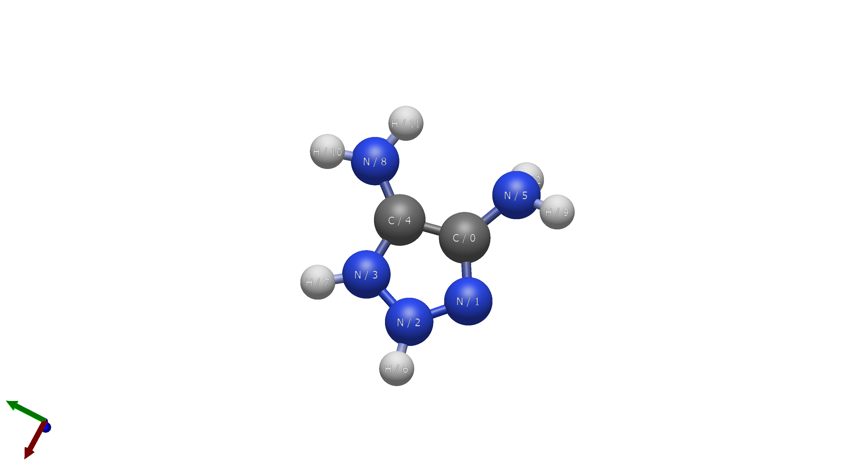
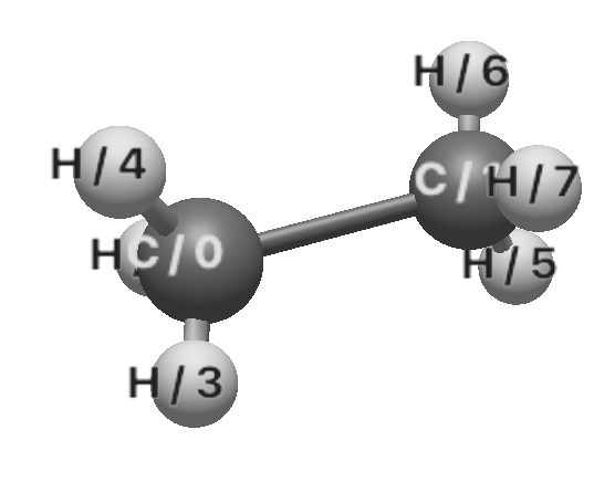
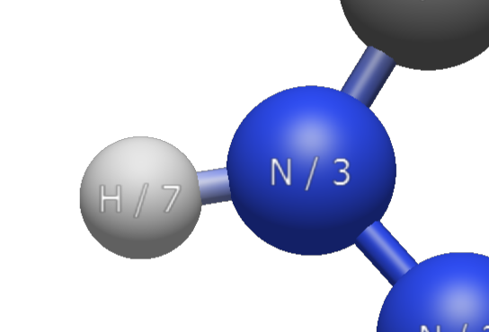
Zooming in, the lettering of the labels is quite clearly very fuzzy compared to the atoms themselves.

Now, this isn’t exactly the biggest problem, but in general if I’m showing someone a molecule who isn’t familiar with the color scheme (even though it’s a pretty universal color scheme), I find that the labels just look a bit rough compared to the clean atom rendering.

The second thing I’m thinking of is the default label type. Currently, the default is Element, but I think it’d be nicer to have Element & ID as the default, for two reasons. The first is that the zero-index labeling is pretty common in a lot of QC program inputs, so if you were to try and specify some constraints in an input you can just look at the atoms and use the exact numbers on there (no need to keep track of subtracting one from everything). The second reason to use Element & ID is to keep the elements on the atoms, which would keep the original behavior intact for users who are more familiar with that.

I think that’s really my only ideas, although perhaps the default color should get changed too as the white text on white hydrogen atoms can be a bit hard to read, but I really couldn’t think of a better color for now.

My guess is that we need to increase the weight / bold of the text as we increase the size of the labels. The main problem with text rendering right now is that we need a different (better) shader strategy (e.g. GitHub - Blatko1/awesome-msdf: A collection of information and shaders showcasing from basic to advanced usage of MSDF (Multi-channel signed distance fields) for text rendering.)

I thought there was already code for contrasting colors, so please file a GitHub issue on that.

Just opened the issue.

Any thoughts on the idea of changing the default? I’d also be a fan of leaving whatever the last selected label type was as the type that gets set as the default.

(The corresponding GitHub issue is here.)

I don’t think the default needs to be changed, it would just be good to save the labels configuration to the user’s settings file/the Windows registry.

1 Like

It should be doing that already. I’ll check the code later today.

(sigh)

So there’s a bunch of code for the labels to read the settings, but surprisingly nothing to set the atom, bond, or residue options.

I’ll sneak a complementary color tweak into this pull request too.

1 Like

I’m also inclined to switch to generally using bold text:

Thoughts?

To my eyes the two colours are different weights - white text was good before but the black too thin, whereas now the black is OK but the white too thick for my taste.

It’s because of the slight blurring when scaling. It’s certainly possible to change the weight depending on the color / lightness of the the text.

The ideal thing is to use a better text render system, but that’s not a quick fix.

2 Likes

I’m not 100% sure the high contrast “works” in every scenario right now. For example, this wildly cursed molecule I’m running some calculations on:

I don’t think the blue on the blue nitrogens is 100% intended, since it actually is a bit harder to read than just plain white would be. If I had to pick a color it’d probably be white, or the yellow that is used on the oxygens. There are definitely still some elements with poor contrast on the labels, e.g. Vanadium and Titanium, but most of them are quite good. I don’t know for sure, but there might be a way to write a python script that has all of the elements’ colors and then match up a corresponding high-contrast color that is colorblind friendly. If I have some time this week I might try to write that myself.

If you’re interested, I’ve made some XYZ files that have every element aligned like they are in the periodic table, so things can be a bit easier to visualize.


periodic_table.xyz (6.0 KB)
periodic_table_inline.xyz (6.0 KB)

Oh, and Oganesson is jussssttt a touch tiny…

Yeah, that doesn’t look great (e.g., grey on grey for Vanadium)

To be honest, I’m sure GitHub search or even an AI vibe code could supply something useful for our purposes as well (i.e., find a colorblind-friendly contrast color). If someone can come up with a better function, that would be really helpful.

The current code for the contrasting color function is here. It should be fairly easy to understand.

I’ll hold off on adding bold until we fix the contrasting colors.

What about just (slightly bolder than currently) white with a dark shadow? That’s the most common technique for ensuring visibility of text against non-homogenous coloured backgrounds, no?

I’m not sure we can easily do shadows with our current text shader.

OK, pity. Then the automatic contrasting colours sounds good.

The only other thought I had was maybe having a white translucent background behind each letter.

I tried out using ChatGPT this is the result. I am more a Python programmer so I validated it in Python I would say it works alright.

The idea ChatGPT came up with is (as you can see in the function comments), to rotate the hue by 180°. Depending on the lightness, make the contrasting color either light or dark. Use the same saturation or use a minimum of 0.5.

The minimum saturation and the lightness might require some tweaking I would assume. Now for white #FFFFFF you get #3FBFBF which aren’t the most contrasting I would say. Mostly the lightness setting is to blame.

import colorsys
import matplotlib.pyplot as plt

def main():
    
    input_color = "#808080"
    contrast = get_colorblind_friendly_contrast(input_color)
    print("Contrast color:", contrast)

    plt.figure(figsize=(2, 1),dpi=600)
    plt.subplot(1, 2, 1)
    plt.imshow([[tuple(int(input_color.lstrip("#")[i:i+2], 16)/255 for i in (0, 2, 4))]])
    plt.title("Original")
    plt.xticks([],[])
    plt.yticks([],[])
    
    plt.subplot(1, 2, 2)
    plt.imshow([[tuple(int(contrast.lstrip("#")[i:i+2], 16)/255 for i in (0, 2, 4))]])
    plt.title("Contrast")
    plt.xticks([],[])
    plt.yticks([],[])
    
    plt.tight_layout()
    plt.show()

def get_colorblind_friendly_contrast(hex_color):
    # Convert hex to RGB
    hex_color = hex_color.lstrip('#')
    r, g, b = [int(hex_color[i:i+2], 16)/255.0 for i in (0, 2, 4)]
    
    # Convert RGB to HLS
    h, l, s = colorsys.rgb_to_hls(r, g, b)
    
    # Flip hue by 180° (rotate on the color wheel) and adjust lightness
    h_contrast = (h + 0.5) % 1.0
    l_contrast = 0.5 if l > 0.5 else 0.7  # Try to ensure brightness contrast
    s_contrast = max(0.5, s)  # Boost saturation for clarity

    # Convert back to RGB
    r_c, g_c, b_c = colorsys.hls_to_rgb(h_contrast, l_contrast, s_contrast)

    # Convert to hex
    contrast_hex = '#{:02x}{:02x}{:02x}'.format(
        int(r_c * 255), int(g_c * 255), int(b_c * 255)
    )
    return contrast_hex

if __name__ == "__main__":
    main()

1. List item

1 Like

Since I don’t have a chance to run that, could you post an image or some examples?

One thing that makes it a bit tricky is the spheres don’t have uniform colors / luminance. But it’s worth experimenting a bit.

I actually think I’ve got a more rigorous solution that could be implemented, I’m testing it right now but it takes a while to run each time.

Essentially what I’m doing is trying to implement the Daltonization algorithm for single colors (all the code that exists and the documentation is for converting whole images so it’s taking me a bit of time to break it down into the fundamental steps). The algorithm I’m following is from this paper and should in theory let me convert any color to the colorblind equivalent of it.

After that I plan on taking the color and, unless I can figure out a better algorithm, iteratively search the entire 0-255 color space for each kind of colorblindness and use another formula to convert the color from the sRGB space to Lab* space defined by CIELAB, then use the CIEDE2000 algorithm to calculate the difference between the two colors. Whichever color has the highest ΔE* from that formula is the color I’d use.

Since parallelization is quite trivial in python, I imagine searching the colors of all 118 atoms will only take a few minutes, after which we can just have a few easy lookup tables with the high contrast labels for any kind of colorblindness.

2 Likes

Sure, generating a lookup table for contrast colors seems useful. We already have the element colors in elementdata.h - for example:

unsigned char element_color[][3] = {
  // See, for example http://jmol.sourceforge.net/jscolors/index.en.html
  // Changes - H is not completely white to add contrast on light backgrounds
  //         - C is slightly darker (i.e. 50% gray - consistent with Avo1)
  //         - F is bluer to add contrast with Cl (e.g. CFC compounds)
  // # Du             # H                 # He
  { 17, 127, 178 },
  { 240, 240, 240 },
  { 217, 255, 255 },
  { 204, 128, 255 },
// … etc.

@brockdyer03’s solution is certainly a more elegant method and I would assume both more robust and giving better results. I am curious how it will turn out.

For completeness I still wanted to share some color pairings the python code made:
#f0f0f0 #3fbfbf (H)
#7f7f7f #8cd8d8 (C)
#3050ff #ffd700 (N)
#ff0d0d #00feff (O)
#b2ffff #ff0000 (F)
#ff8000 #65b2ff (P)
#ffff30 #0000ff (S)
#1ff01f #ee10ee (F)

They are not super appealing in my opinion, for example the H and C contrast colors are light blue but I would prefer them to just be greyscale.

1 Like