I posted PR to change font to Poppins as above. However, I also have doubts about whether this is better than native.
Please let me know your opinions!
Maybe? I’ll be honest that I don’t see a huge difference on my Mac. Are you on Windows? What font is used before the change? It’s marked to default to the system font IIRC.
I think some change to the header / subheader (h1, h2, h3) font might be useful to provide contrast with the main text. Poppins might be useful there since we could bump up the weight (e.g., a bit bolder?)
I don’t have a good feeling for common web fonts anymore. A quick look of other sites using the pydata theme might be useful: Gallery of sites using this theme — PyData Theme 0.15.4 documentation
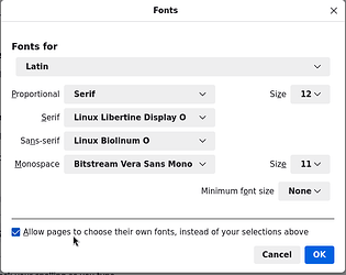
Under Edit → Settings, the Firefox web browser opens a menu of settings; tab general to define default fonts which, if wanted, may overwrite the font selected by the host of the page:
As an illustration, the same page with its own fonts:
and once with browser overwritten fonts
Given this observation, and a recall how the landing page looked like back in August: is it worth the effort? I don’t see a significant change for the better. To me, the previous font selection for the page (i.e., two.avogadro.cc) already was well legible and thus good enough.
That’s a good idea, but it can’t smoothly express the detailed weight of the font (semibold, light, etc.)
If we define the font on our website, we can express the detailed weight of the font!
Let me know if you have any suggestions!
I’m using Windows.
Mac has good default fonts which makes article readable.
But Windows doesn’t.
Changing themes is a good option!
But I think it should have user-friendly fonts, and I think it’s a big problem if the fonts get in the way of users reading our documentation.
Actually no, what @Thomas says is right – only if Firefox is explicitly told to override a page’s font does it affect the appearance of the website. So at least under Firefox on Linux (I guess it could be different on Mac or with other browsers), the website is prescribing some font to use.
…so I’d also like to know this.
In terms of the discussion of prescribing a font in general, I think there are three aspects/considerations at play. One is readability, as mentioned. The other two are very much intertwined and are about brand identity and general graphic design.
If the whole text of the whole website was to be set into a particular font, that would be a statement about brand identity and design that would have to be carried through across everything really, which is then a) a fair bit of work and b) not a trivial decision, as any graphic designer will tell you.
And most arguments that could be made in favour of prescribing fonts website could also be made for doing the same for the desktop program, which currently is also set to use the system font (as Qt apps typically do). So that opens another can of worms…
Finally, in terms of the actual specific choice of font, I don’t personally think Poppins is a better choice than the current one, which I find pretty legible.
Also, is this even true? Can’t one prescribe the weight to use without specifying the typeface? Besides which, it seems like the website might already define the font.
For sure.
Yes. I wouldn’t consider myself a web expert, but it’s in the CSS font-weight
I think you’d do something like:
h1 { font-weight: bolder; }
h2 { font-weight: bold; }


