A while ago, @brockdyer03 and @matterhorn103 suggested some tweaks to the atom label colors and contrast: Ideas for changes to the Labels display type
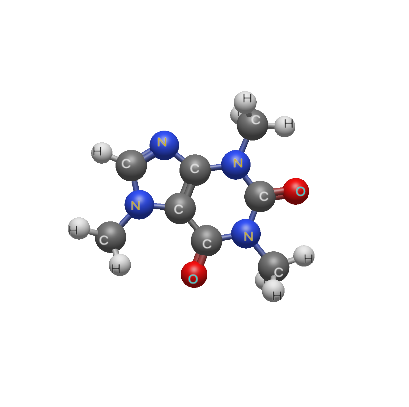
Here’s what we had in v2.0.0:
Here’s what’s coming for v2.1:
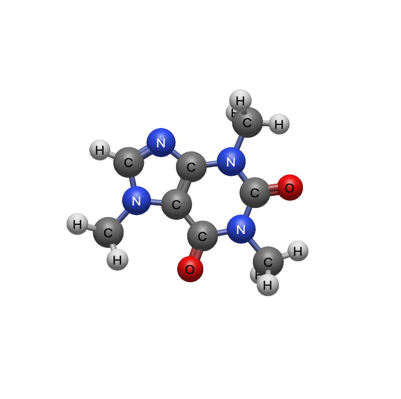
I’m still on the fence about white-vs-black on carbon. But there are models for color contrast and it turns out that generally white-on-color or black-on-color produce the best contrast.
Also, fixing a bug in the text rendering has significantly decreased the “fuzzy text” look particularly on hi-res screens.
Do people prefer the white text on carbon? Other feedback?