Just a quick suggestion, with the darkmode version of the website there isn’t much to visually highlight that part:
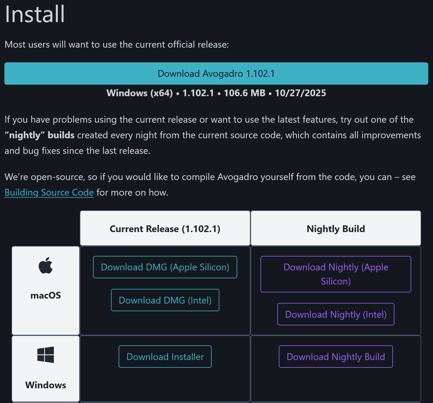
I’d recommend drawing a white box around the section that tells you the info about the version it is suggesting (Windows (x64) • 1.102.1 • 106.6 MB • 10/27/2025 in this case), just like with the part for Current Release and such, that way it stands out a bit more.